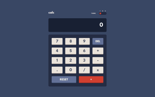
Calculator App w/React

Solution retrospective
I'm proud of being able to create a Calculator App that is similar to the simple (non-scientific) version of the calculator that you would find on your laptop. I was able to make it accessible to users using the keyboard and the mouse and both methods of use function the same way. I was able to learn a lot about how Number data types work on JavaScript and the limitations that JavaScript has in working with these numbers. I had to incorporate the bignumber.js library to help me deal with these limitations. Many functions had to be written to keep track of the user input and change how it looks like on the screen (i.e. adding commas based on place value) and making sure that incorrect inputs don't interfere with the calculation.
My biggest criticism of my project is that because I had to create so many different functions to deal with different potential problems, the code isn't the cleanest that it could be and in some areas you can argue that it is not DRY.
What challenges did you encounter, and how did you overcome them?The biggest challenge in creating a calculator app is keeping track of all the aspects that are involved in making a calculation and the stage of the calculation process that is currently happening. To deal with this, I found it helpful to a single state object with multiple properties, each of which is responsible for one part of the calculator process (e.g. first operand, second operand, the operator that was chosen by the user (whether it exists or not), whether there is a latest input etc.)
The next challenge was validating user input to make sure the user entered a correct input into the calculator that would not mess up the calculation (e.g. dividing by 0 or entering multiple 0s before a decimal). Next, we have to look at the current number in the calculator, turn it into a string that separates the integers from the decimals and put commas on the integers based on the correct placeholder. Lastly, we have to limits the amount of digits that can be placed on the screen so that the number isn't excessively long. I modeled my calculator after the calculator seen on the laptop and they limit the amount of digits on the screen to 16 at the most. If a number is longer than 16 digits, they express it in scientific notation.
My last challenge was altering the font size of what is written on the screen to fit the size of the container. To solve this, I found useRef and useEffect to be very helpful features in React.
What specific areas of your project would you like help with?As I wrote earlier, I had to write a lot of functions to make this project work so there are areas of the project that can't be called clean code or DRY. I would appreciate feedback telling my how I can write my code better to accomplish the same goal with cleaner code.
Please log in to post a comment
Log in with GitHubCommunity feedback
No feedback yet. Be the first to give feedback on Mina Makhlouf's solution.
Join our Discord community
Join thousands of Frontend Mentor community members taking the challenges, sharing resources, helping each other, and chatting about all things front-end!
Join our Discord