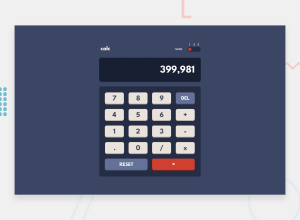
Design comparison
Solution retrospective
I would appreciate feedback on how I can make my code better. Also how do you make your grid gaps responsive?
Community feedback
- @darryncodesPosted almost 3 years ago
Hi Renzo,
Really great solution, it looks brilliant - I hope to tackle this challenge soon.
- regarding relative gap sizes. you should look into relative units instead of px. Using rem for example the unit would scale up and down relative to the root font-size. This is a good starting place
- i also found this great article about how to create a theme switcher, your design would be perfect if you implemented the other colours
All the best with it!
Marked as helpful1@renrasPosted almost 3 years ago@darryncodes Yeah I don't really like the way I implemented my theme switcher. Thanks for the tip!
0 - @MiculinoPosted almost 3 years ago
Congrats on completing the challenge, @renras!
I like how your solution looks and feels. Regarding your question, a possible solution for making the grid gaps responsive is using the clamp function https://developer.mozilla.org/en-US/docs/Web/CSS/clamp()
Also, there's a little issue with the calculator: If I try to make more than one successive Math operation, your calculator won't work. It only works if you do an operation between two numbers and then press the "=" button
Marked as helpful1@renrasPosted almost 3 years ago@Remus432 Thankyou! using clamp totally solved my problem.
0
Please log in to post a comment
Log in with GitHubJoin our Discord community
Join thousands of Frontend Mentor community members taking the challenges, sharing resources, helping each other, and chatting about all things front-end!
Join our Discord
