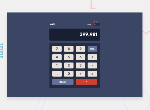
Design comparison
Solution retrospective
This is my second challenge. I did this challenge because I want to improve my skills in using grid. Never thought that the theme switch toggle will be the most challenging part for me. Hope you can give a feedback in my work, hope you like it!!
Community feedback
- @Da-vi-dePosted over 3 years ago
Hi, it looks perfect and it works! Very good job for this challenge. The only thing i want to point is scss files, in my opinion you don't need all those folders and files, for what i understand it's better having bigger files than too many small ones, for example: components could be just a file with all components in it, you can add comments to highlight what component is. Now imagine if you need some help and someone has to take a look at your code, it's a bit frustrating going back and forth many times.
Well done, happy coding :-)
Marked as helpful0@ruedasjnthnPosted over 3 years ago@Da-vi-de hey thanks bro, i'll keep that in mind. i really struggle how to properly arrange my scss files i already look to some github repo on how they arrange their files still doesnt help xD
1@Da-vi-dePosted over 3 years agoIf it can help take a look at my last project which is quite big there's just a scss folder, it's similar to yours but less files. Ask me anything if you need.
0
Please log in to post a comment
Log in with GitHubJoin our Discord community
Join thousands of Frontend Mentor community members taking the challenges, sharing resources, helping each other, and chatting about all things front-end!
Join our Discord
