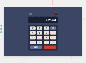
Design comparison
Solution retrospective
The appearance of my application was very similar to the original challenge. However, the display that does the calculations and some operations cannot be done well.
What challenges did you encounter, and how did you overcome them?one of the main challenges is the button to change color.
What specific areas of your project would you like help with?I would like help to improve the appearance of the numbers on the display. and the operation of numbers.
Community feedback
- @DomilsonFirminoPosted 5 months ago
well done, the design implementation and the theme swap is very good. Somethings i would like you to give a look is the "+-*/" signals when i choose a two in a row them both show up in the display. And the Error message It should disappear when the user is typing again. Good luck in the next challenges I am spectating to see then
0@DaniloFrancPosted 5 months ago@DomilsonFirmino Thank you for your feedback! I have so many thing to improved in this solution.
0
Please log in to post a comment
Log in with GitHubJoin our Discord community
Join thousands of Frontend Mentor community members taking the challenges, sharing resources, helping each other, and chatting about all things front-end!
Join our Discord
