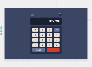
Design comparison
SolutionDesign
Solution retrospective
I hope people can help me improve my design. Help gladly accepted.
Things I did wrong, or best practices I could have used. Anything really.
I'll be changing things here and then, firstly the compatibility on the input[range] with other browsers as I didn't want to spend too much time doing it now. (Best view on Chrome lol)
Community feedback
Please log in to post a comment
Log in with GitHubJoin our Discord community
Join thousands of Frontend Mentor community members taking the challenges, sharing resources, helping each other, and chatting about all things front-end!
Join our Discord
