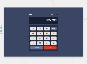
Design comparison
SolutionDesign
Community feedback
- @AmitKumar-001Posted 11 months ago
I'm waiting for your feedback and suggestions to improve it!
0@MaximilianoDanielGarciaPosted 11 months agoHi @AmitKumar-001, great job!
If you are wondering why isn't look centered, It's because you need to add this:
body{
    min-height: 100vh;
    align-items: center;
    padding: 0;
    margin: 0;
}
I think the calculator should be wider, try changing to
width: 450pxon#wrapperand#screen.After you apply these it will look better.
Marked as helpful1
Please log in to post a comment
Log in with GitHubJoin our Discord community
Join thousands of Frontend Mentor community members taking the challenges, sharing resources, helping each other, and chatting about all things front-end!
Join our Discord
