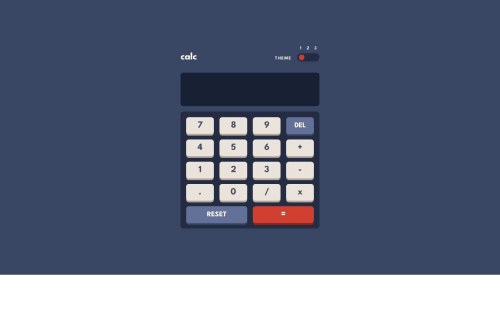
Submitted over 2 years agoA solution to the Calculator app challenge
Calculator App with 3 Different dynamic themes
@rajkp10

Solution retrospective
Hello there 👋, I am @rajkp10
The challenge is quite easy from the logical point of view.
However, implementing 3 different themes was a bit of a challenge for me as I have not worked with multiple themes in the past. So, it took some time for me to figure out how to design the solution.
The themes are implemented using CSS3 and Vanilla Javascript only.
Any kind of suggestion regarding the code or the design are most welcome. 🙂
Code
Loading...
Please log in to post a comment
Log in with GitHubCommunity feedback
No feedback yet. Be the first to give feedback on Raj Patel's solution.
Join our Discord community
Join thousands of Frontend Mentor community members taking the challenges, sharing resources, helping each other, and chatting about all things front-end!
Join our Discord