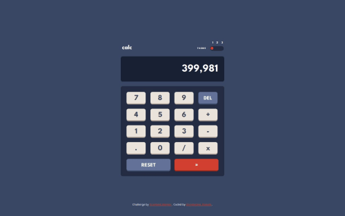
Calculator App using Test Driven Development

Solution retrospective
Using TDD made it much simpler for me to create the features that I needed in the calculator while remaining confident that I had no introduced any additional bugs or reversions.
What challenges did you encounter, and how did you overcome them?Since there is no native "slider" element, I found a group of styles that would recreate the look and feel of a slider with a "range" input field. I chose to keep those styles separated from the rest of the styling, to keep the slider modular.
What specific areas of your project would you like help with?I had the greatest difficulty in reliably formatting the calculator's results to a specific number of digits without introducing other bugs. Any pointers would be appreciated.
Please log in to post a comment
Log in with GitHubCommunity feedback
No feedback yet. Be the first to give feedback on Chris Ekstedt's solution.
Join our Discord community
Join thousands of Frontend Mentor community members taking the challenges, sharing resources, helping each other, and chatting about all things front-end!
Join our Discord