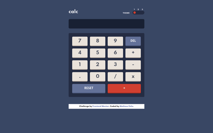
Design comparison
SolutionDesign
Community feedback
- @karimsehPosted almost 3 years ago
Hello @MatheusFelixTI , you did really well, your solution is very close to the design, however i have some small observations:
- You can delete the button's shadow when it is on
:focus, so that it will have a click effect. - You have to catch calculator errors like dividing by zero, etc..
Thank You 👋
Marked as helpful0 - You can delete the button's shadow when it is on
Please log in to post a comment
Log in with GitHubJoin our Discord community
Join thousands of Frontend Mentor community members taking the challenges, sharing resources, helping each other, and chatting about all things front-end!
Join our Discord
