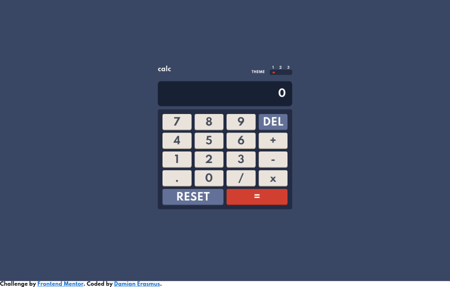
Design comparison
Solution retrospective
So, except for the bonus section, I believe I have completed every other part of the challenge, but I'm still a novice so my question is:
Have I missed anything in terms of the functionality or general design of the calculator?
Community feedback
- @palgrammingPosted over 3 years ago
well it look pretty good with with a few quick logic computations checks. I would try to add a hover effect to the buttons so you user can see some action when they are pressed or do simulate them being pressed. But so far a great job on a complicated challenge
0@DamianErasmusPosted over 3 years ago@palgramming Hi thanks for the feedback. So when the buttons are clicked the scale is changed to 0.9 and the box-shadow is removed. I thought that properly simulates the buttons being pressed. Could you suggest another way to achieve the button pressing effect?
0@palgrammingPosted over 3 years ago@DamianErasmus well sorry I guess I should have said you should add a slight change on hover maybe
try
.btn_basic:hover,
.btn_del:hover,
.btn_res:hover,
.key_equal:hover,
.key_operator:hover{
    opacity: .9;
}
just to see what you think
0@DamianErasmusPosted over 3 years ago@palgramming Ah I see what you mean! Yes, that does look like a good idea. I'll add it soon
1
Please log in to post a comment
Log in with GitHubJoin our Discord community
Join thousands of Frontend Mentor community members taking the challenges, sharing resources, helping each other, and chatting about all things front-end!
Join our Discord
