Design comparison
SolutionDesign
Solution retrospective
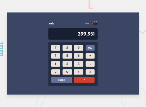
here is my solution for Calculator app
in this project, my goal was to learn grid and CSS variables.
one thing that I'm not sure I'm doing right is way I used CSS variables to change theme color.
I will be really glad if you give me any suggestion on how to improve my code.
Community feedback
- @besttlookkPosted over 2 years ago
Hi, Following are some issues i like to point out:
- On entering higer no, number overflows. To avoid you can use "word-break:break-all".
- Try to use semantic HTML tags as much as possible for better accessibility. Like in your case to wrap the main content use <main> tag instead of <div>
- Text is not property aligned inside the button. If you care using fixed height for the button, use flex to center else use padding-top and padding-bottom to center the text. For flex you can do tihs
button{ height:50px; display:flex; align-items:center; justify-content:center: }- If number is not present do not allow user to choose operation.
- Operation should not repeat. (+++++). This makes no sense.
I have also completed this challenge. You can look into it just for reference.
Good luck,
Happy Coding
Marked as helpful1@mooryxPosted over 2 years ago@besttlookk thanx for the feedback ill try to fix these issues
0
Please log in to post a comment
Log in with GitHubJoin our Discord community
Join thousands of Frontend Mentor community members taking the challenges, sharing resources, helping each other, and chatting about all things front-end!
Join our Discord
