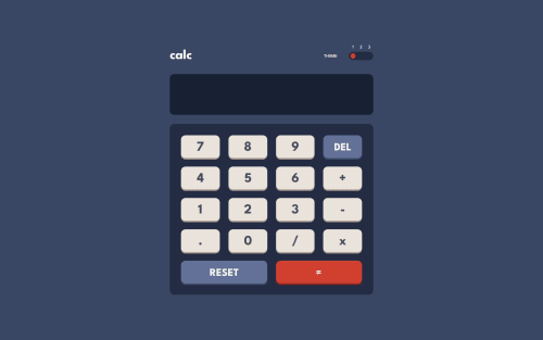
Calculator App using CSS Grid, JS

Solution retrospective
Well, firstly I made a lot of mistakes and I fixed all of them. At the end I understood that this I actually made core mistake and made this challenge with flexbox and made it with Grid afterwards! During this time, I had some issues but really, I learnt a lot and that's my biggest proud about this challenge. What would I do differently? Well, read description next time so I don't make grid challenge with flexbox :D
What challenges did you encounter, and how did you overcome them?Being honestly, a lot of them. From learning CSS Grid from scratch to JS methods and functions. Also, huge point here is understanding of balance between CSS and JS. Where should I use CSS or JS, or maybe both. Stuff like that.
What specific areas of your project would you like help with?I want to have reviews on it since I spend a lot of time on it, so I want to see feedback. Even if it's negative, I just want to learn and if there is anything I could do better at this point, I just want to know it :D
Please log in to post a comment
Log in with GitHubCommunity feedback
No feedback yet. Be the first to give feedback on Yaroslav Petrov's solution.
Join our Discord community
Join thousands of Frontend Mentor community members taking the challenges, sharing resources, helping each other, and chatting about all things front-end!
Join our Discord