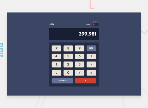
Calculator App Solution (JavaScript, grid, flexbox)
Design comparison
Solution retrospective
Thank you for reviewing the project! I have the following questions and I would really like some feedback to help improve this and future projects.
-
a. Was the theme switch intended to be 'draggable'? I was thinking it should have been because the slider has a hover effect, but I am not sure that is possible with the current input/radio solution.
-
b. Is there a simpler way to implement this switch and if so, would you please share a keyword to research?
-
For the hover behavior on the keypad buttons, from the spec, it looks like the button face and not the shadow should change with the hover. I got a version of that working, but I am thinking there may be an easier way to implement this and would like to know what I missed.
Thank you for any feedback, it is greatly appreciated!
Community feedback
- @palgrammingPosted over 3 years ago
It looks like you have a good start on the process
- I think it would be good to limit the number of characters in the display
- There is no visual change when tabbing through elements
- Some of the keyboard input it working I can enter 3+3 with the keyboard but the the enter key should also work as the ='s key
0@davidrhynePosted over 3 years agoThank you for the feedback!
- I have limited the number of characters to 11 and will give the result in exponential form if the result is over 12 digits. I can tweak those numbers, but what do you think?
- I added the :focus pseudo classes to the button. I gave the the same effect as hover, but not sure if that is too subtle. It seems like focus is active when the mouse is clicked, so I am trying to avoid making the effect too obvious. Should I have a different approach?
- And I have the 'Enter' key coded for keyboard input and it seems to work most of the time, but seems to clash with the focus. Meaning, 'Enter' is working if the document body has focus, but once the tab key is used to navigate the buttons, then the 'Enter' key seems to interacting with the focused button instead of the document.
Thank you again for the feedback and please let me know what you think of the changes.
0 - @lc-dev90Posted over 3 years ago
overall looks very good!
0
Please log in to post a comment
Log in with GitHubJoin our Discord community
Join thousands of Frontend Mentor community members taking the challenges, sharing resources, helping each other, and chatting about all things front-end!
Join our Discord
