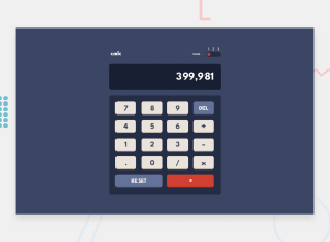
Calculator App, Responsive size, Preference check, w/ small animations
Design comparison
Solution retrospective
This one was tricky just for the the 3 state toggle! Trying to come up with something that handled more than just "checked" and "not checked" and would look like a toggle was a challenge all by itself, but I think my solution turned out really well!
I wish the middle state for the toggle state didn't snap to its location and was animated to its spot like left and right are, but I couldn't figure that out. Let me know if you have a solution!
The calculator handles all basic calculator functions, as well as handling errors and clearing its own answers out automatically on a new problem being entered. I'm actually fairly proud of how small the javascript file is for the actual calculator actions. Whole thing almost fits on my screen without scrolling.
The theme does run through a check if you have any saved local preference and if not checks if you have designated dark as your preference, setting the theme to dark if so.
Community feedback
Please log in to post a comment
Log in with GitHubJoin our Discord community
Join thousands of Frontend Mentor community members taking the challenges, sharing resources, helping each other, and chatting about all things front-end!
Join our Discord
