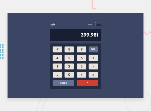
Calculator App - React, Themes, CSS Flex/Grid Responsive Design
Design comparison
Solution retrospective
Hello again, FEM community! 😄
This is my solution to the Calculator App challenge - and boy, was this a fun one! I wrote about my thought process when tackling this challenge in a blog post too!
The hardest part by far was implementing the actual algorithm that powers the calculator - I really wanted to make this calculator's UX feel as close as possible to a native mobile app, so replicating the iPhone's classic calculator app was the natural benchmark I set for this challenge. It took quite some time to get the algorithm working 100% of the time, but it all worked out in the end! 😄 I went into more detail on how I achieved this on this in a recent blog post I made, so if you're stuck on this challenge and need a hand, I highly encourage you to read my article! 😉
The most tedious part though was implementing the three color themes - I had already learned from my previous attempts at theming and finally used React's Context provider. Once I had that setup, I added some conditional class styling, set up three boilerplate stylesheets for each theme, and copied over the colors from the style guide. A relatively straightforward and painless process, all things considered.
Lastly, I used CSS Grid and Flex quite a bit to achieve the correct layout. Making the layout responsive was as simple as making the keypad's buttons and the display width proportional to the viewport's width.
Any feedback would be greatly appreciated! 😉
Community feedback
Please log in to post a comment
Log in with GitHubJoin our Discord community
Join thousands of Frontend Mentor community members taking the challenges, sharing resources, helping each other, and chatting about all things front-end!
Join our Discord
