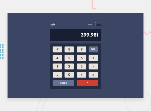
Design comparison
Solution retrospective
This was a really fun challenge which really pushed me to try and find creative solutions to some seemingly complex problems. My code evolved a lot throughout the development stage, even completely rewriting large parts of it at times, but I feel that I have come to a solution I am happy with. The project was completed in about a week/ 10 days, but due to being abroad I was not able to publish it (plus I encountered some really frustrating issues when attempting to publish to gh-pages where some css stylesheets were not being imported).
I would love some feedback, particularly if there are some pieces of code which would be improved (more efficient/elegant).
Many Thanks to all for taking the time to take a look.
Community feedback
- Account deleted
When I launch it, all the buttons are just in a vertical line.
2@steppan26Posted over 3 years ago@thulanigamtee oh wow so it is, how weird I had it working nicely as you can see from the screenshot. I will take a look at that. Thank you
0@steppan26Posted over 3 years ago@thulanigamtee I believe it should be fixed now, if you're still interested :-)
0
Please log in to post a comment
Log in with GitHubJoin our Discord community
Join thousands of Frontend Mentor community members taking the challenges, sharing resources, helping each other, and chatting about all things front-end!
Join our Discord
