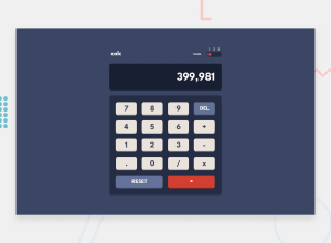
Design comparison
Solution retrospective
This project is a combination of the calculator app from Odin and Frontend Mentor. I used IFFE concept on the calculator. By doing so, I have clean code and most functionality stay inside the calculator object.
For the multiple themes, I used SASS with mixins, functions, and maps. It greatly helped me generate the 3 themes CSS.
What challenges did you encounter, and how did you overcome them?Some challenges I faced was keeping the calculator and UI functionality separate. I felt that I was integrating them together and thus overwhelming in tackling this project. As shown inside my index.js, the code is messy and hard to read. I would like to fix this in the future or find some design pattern to keep clean.
Another challenge I faced was getting Github Pages to work with Parcel. The main issue was that the CSS and JS path were not linked correctly. To fix this, an option flag must be added to the build command: --public-url ./ inside the package.json.
What specific areas of your project would you like help with?Specific areas of the project I would like to be improved upon is having clean code, keeping functionalities separate, and tackling big projects like this.
Community feedback
Please log in to post a comment
Log in with GitHubJoin our Discord community
Join thousands of Frontend Mentor community members taking the challenges, sharing resources, helping each other, and chatting about all things front-end!
Join our Discord
