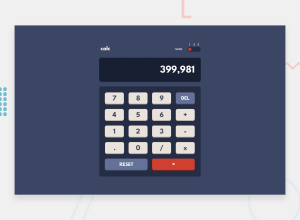
Calculator App mobile responsive and made with flex and grid
Design comparison
Solution retrospective
Hello all, this one is very much interesting and cool challenge, adding to this if you are previewing the site on Google the theme slider doesn't look that cool as it looks on Mozilla(browser that I use) any suggestion on that, would be glad to discuss.
ALSO A QUICK QUESTION How to make my project to reach more people, so that I get more valuable advice, and I want to network with community member, how to do that as well.
Thank you for all the appreciation and valuable time spent to provide feedback
Please log in to post a comment
Log in with GitHubCommunity feedback
- @BeinRain06
Amazing Nayan you ⛏ picked a good challenge to test your JS abilities and your css grid skills. Your questions is about how to fix the show of your Theme container in chrome :
Firstly input tag are sometimes subject of show change based on the browser you use. THAT happens because of different technologies each developer of these companies use to implement the browser
To correct that chrome has come with features like: -webkit-
Concerning your project try to add in
#calc-theme:-webkit-slider-runnable-track { ... margin: 0 auto;
}
And also :
#calc-theme::-webkit-slider-thumb { ... padding :0;
}
Or either one of the both previously mentioned.
You may want also to add transitional effect when the circle of your theme container move
You can do it by adding in #calc-theme an effect
E.g transition :all 1s ease-in-out ;
#calc-theme { .... transition: all 1s ease-in-out ;
}
Hope with that you will be able to make some move to fix the problem Nayan.
Marked as helpful
Join our Discord community
Join thousands of Frontend Mentor community members taking the challenges, sharing resources, helping each other, and chatting about all things front-end!
Join our Discord
