Design comparison
SolutionDesign
Solution retrospective
What are you most proud of, and what would you do differently next time?
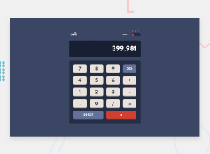
The calculator functions properly, and the color switch feature is working well. I aim to enhance the color switch functionality by enabling it to remember the user's chosen color and persist it across website updates.
What specific areas of your project would you like help with?I try to have "0,00" by default on the screen, but when I start a calculation, I can't find a solution to reset the screen content.
Community feedback
Please log in to post a comment
Log in with GitHubJoin our Discord community
Join thousands of Frontend Mentor community members taking the challenges, sharing resources, helping each other, and chatting about all things front-end!
Join our Discord
