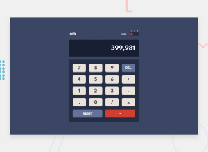
Design comparison
Solution retrospective
What I learned
I had to think a lot with this one, like how to prevent user from :
- typing more than one operator at a time ( e.g.
7++2) - using multiple dots on a single number ( e.g.
3.00.5) - typing a dot without a number before ( e.g.
.3)
I also had an idea for the theme switcher :
I'm putting all my DOM elements into an array, and interating through it with a forEach(), this way I'm using one line of code instead of one line for each DOM element I wish to change.
I made the toggle by myself this time, without getting any help or ressources on the internet, I'm pretty proud of it.
I used the .replace(/x/g, "*"); function, which replaces all the x by *, which makes it more readable for the user.
Way of improvement
It would be a nice addition to allow the user to type on his keyboard instead of clicking.
Community feedback
- Account deleted
On the theme toggle I think you be able to click on the corresponding position on the pill rather than on the thumb itself.
2@pierre-pellegrinoPosted over 3 years ago@thulanigamtee Thank you for your advice, will do !
0
Please log in to post a comment
Log in with GitHubJoin our Discord community
Join thousands of Frontend Mentor community members taking the challenges, sharing resources, helping each other, and chatting about all things front-end!
Join our Discord
