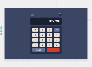
Design comparison
Solution retrospective
I learned a lot from this project. First of all, I had some issues with the theme switcher. Didn't know what the best approach is so I had to investigate and read a lot of articles but eventually I got there. Also added 'prefers-color-scheme' which sets theme depending on users operating system setting or user agent setting.
Calculator logic in JS was also a lot of work. I am proud of successfully adding user input to the calculator. So u can do all operations with just a keyboard. Also added 'toLocaleString' which I encountered for the first time. It's a nice hack to separate numbers with commas to make it look like a real calculator.
Overall it was a challenging project and I had a lot of fun working on it! :)
If anyone wants to check this calculator out, and leave some comments, it would be awesome!
Community feedback
- @zougari47Posted almost 3 years ago
I test all possible errors but your work was perfect, congratulation 🎉.
1
Please log in to post a comment
Log in with GitHubJoin our Discord community
Join thousands of Frontend Mentor community members taking the challenges, sharing resources, helping each other, and chatting about all things front-end!
Join our Discord
