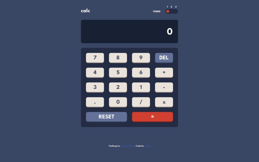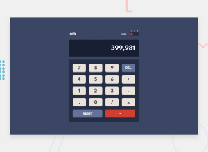
Design comparison
SolutionDesign
Community feedback
- @AfnanmkPosted over 1 year ago
Congratulations on completing the challenge! I am sure you have put a lot of effort into it. Your code is well-structured and readable. The layout also looks good on different screen sizes. I have a few suggestions for you to improve your project further.
- You can center the calculator container on the screen by applying the below code snippet -
body { width: 100vw; display: grid; min-height: 100vh; place-items: center; }- The height of your result display screen increases when the numbers are bigger. It does not look good and messes up the layout. You can avoid that by adding
overflow:scrolland removingheight:autoin .calc-display . Also, removeoverflow-wrapfrom .result-field
Marked as helpful0
Please log in to post a comment
Log in with GitHubJoin our Discord community
Join thousands of Frontend Mentor community members taking the challenges, sharing resources, helping each other, and chatting about all things front-end!
Join our Discord
