Design comparison
Community feedback
- @TheRealByteraverPosted about 2 years ago
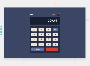
Cool design, it differs from the frontendmentor one but I suppose that was intentional. The mobile design is not finished I suppose? It did not work for me. Also, one small detail you might want to fix is that the number resulting of an operation can overflow the display. I solved this by using scientific notation. Good job overall +1
0@Ejdam090Posted about 2 years ago@TheRealByteraver Thanks for the feedback. I don't seen this issue in mobile, i will fixed it. And i forgot about that the number can be overflow the display....
0@TheRealByteraverPosted about 2 years ago@Ejdam090 Hi! Either you fixed it already or I confused your implementation with somebody else's, because it works fine now. In the latter case, I do apologize! IIRC, the zoom out effect (when the page loads) got somehow "stuck" and the buttons of the keypad were all over the place. Again, might have been me confusing it with another persons' calculator. What I did notice now however, is that whenever I enter a huge number and hit the multiplicator button after that, the display does not show the second operand whilst typing it. So, A x b --> b is not shown while typing. Not sure what is going on there, you might want to look into that. Or not, of course ;)
0
Please log in to post a comment
Log in with GitHubJoin our Discord community
Join thousands of Frontend Mentor community members taking the challenges, sharing resources, helping each other, and chatting about all things front-end!
Join our Discord
