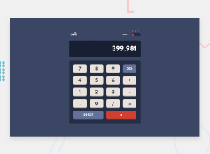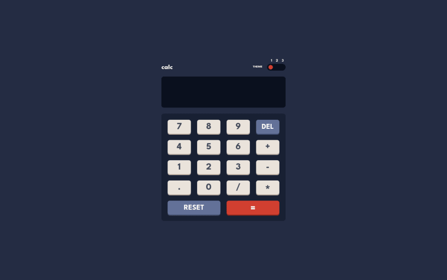
Design comparison
Solution retrospective
This was a tough one. I really put my heart and soul in building this project. Kindly take a look and suggest any change if needed any
Community feedback
- @ChamuMutezvaPosted over 2 years ago
Greetings Ramkrishn. So far so good with your calculator solution, i completed the same challenge a few weeks ago using React. You can find my solution here. Having said that , here is my observation:
- generally any website should have a heading , especially the h1 heading element.
- it is very important to use semantic html elements , that makes your site accessible to many users. The theme should have been a group of radio buttons, because they allow only one selection at any given time(specifically designed for that - assistive technology is able to interpret that). To get the same benefits with elements like that with divs and spans - that will require a lot more coding. Try operating the calculator using a keyboard only.
- one issue with the
<input id="main-input" type="text" name="calcInput"></input>
, i think this should be not an input field - it is just there to display the values that are supposed to be entered by the numbered buttons. With inputs , you normally have to directly type something into it. That also brings me to the behaviour of the calculator - directly typeRamkrishn * Rai’s = post
in the input field. You would not want a calculator to behave such way. - the
grid-items
, should have been buttons instead of divs for the same reasons mentioned earlier about semantic html. Pressing the numbered button should allow a number to be displayed on the screen - this is not happening.
In conclusion , you need to revisit this challenge and get the html structure right.
0@Ram0O7Posted over 2 years ago@ChamuMutezva Actually I'm a beginner and while building this project I was mainly focused on Javascript and how can i make my project look as close to the challenge as it can,so i didn't really focus on accessibility,Also it seems difficult for me to design buttons than divs. Thanks for pointing out the mistakes I'll see what changes can i make to make it more accessible.
0
Please log in to post a comment
Log in with GitHubJoin our Discord community
Join thousands of Frontend Mentor community members taking the challenges, sharing resources, helping each other, and chatting about all things front-end!
Join our Discord