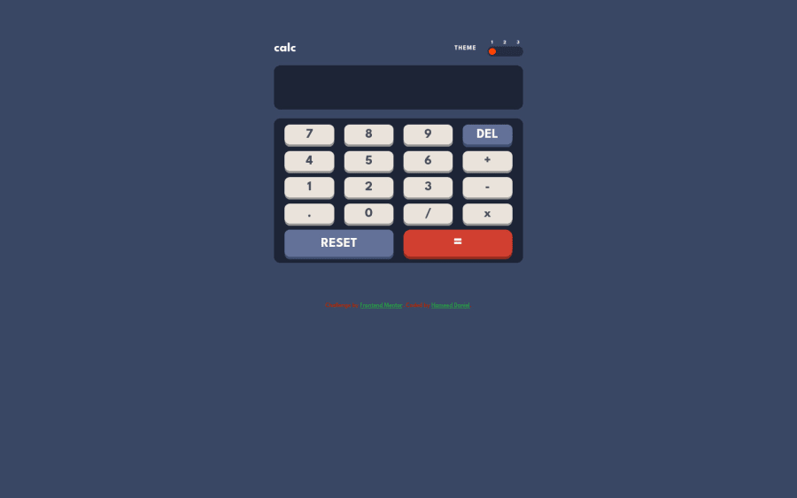
Design comparison
Solution retrospective
what else could I have used for the solve button..I used the eval() method
Community feedback
- @ChamuMutezvaPosted over 2 years ago
Hi Daniel Hameed
I will add more to what have been said above.
- the html for the theme switcher will need some revision, it is ideal to use radio buttons in a fieldset. Radio buttons allow one selection from a group which is exactly what we need. You have used p elements and div elements which are not accessible to assistive technology users and at the same time there is repetition of interaction where both the
panddivsall have click events for the same purpose. - add focus state that can assist keyboard users know where the current focus is when tabbing on a keyboard.
- let your calculator have maximum number that can be entered , we can not have a calculator that takes any number that the user desires.
- a calculator should guard against some of the following , try it in your calculator
9++++++9++++++*******----4.......3.36...
- try the following calculation
0.1+0.2
I concur with @elaineleung on the need to do challenges of a lower level than this one . This calculator has some twist and turns that needs to be carefully implemented . I would suggest the tip calculator for now
Happy coding
Marked as helpful2@HDanielOPosted over 2 years ago@ChamuMutezva Thank you so much 🤲🏾. This challenge has shown me I still have a lot of learning to do
1 - the html for the theme switcher will need some revision, it is ideal to use radio buttons in a fieldset. Radio buttons allow one selection from a group which is exactly what we need. You have used p elements and div elements which are not accessible to assistive technology users and at the same time there is repetition of interaction where both the
- @elaineleungPosted over 2 years ago
Hi Daniel, good attempt in building this project, and I just wanted to answer your question about
eval():I also used
eval()at first, but after reading up more about it on MDN and reading Stack Overflow posts that explain why it shouldn't be used, I ended up using a switch statement for the four operators. Here's the link to the MDN article oneval(), and I highly recommend that you read it and consider whether to useeval(): https://developer.mozilla.org/en-US/docs/Web/JavaScript/Reference/Global_Objects/evalAnyway, I tried out your calculator, and I really only got three main comments:
-
I think you need to write a bit more logic in your function for the computation, and I also think you need to have a look at how real-life calculators work (whether they are single-step or expression evaluators). I know there aren't too many specific instructions for this challenge, but I think it should be assumed that this calculator is meant to function in a way that real-life calculators function. What this means is that, let's say I enter "3", "+", and then "5"; I get the answer "8", which is the desirable and correct answer. Then say I wanted to input another number for the next calculation, and that number is "2". What I see on the screen is not "2" but "82" because the display is not cleared and the calculator simply appends the new digit to the previous answer.
-
Good job in getting the themes to work! The only thing is that, how the JS is written is rather clunky and hard to read, as it's a bit too repetitive right now with all the adding and removing of classes. I also don't think this is the most ideal way to write the theme function. I would suggest that you look into how else the themes can be wired up and do try some refactoring and use of
forEachor aforloop. -
You have quite a number of issues in your HTML report! Some of involve very fundamental principles being broken, such as
idbeing used more than once. I think you'll need to be careful here and try to remember the basics as you're writing your HTML.
In reviewing your work here, I suggest that you try a few more Junior level projects first that involve writing JS before you tackle more intermediate projects, which I think are a bit beyond your level right now. Otherwise you may find those projects quite challenging! Good luck, and keep going 😊
Marked as helpful2@HDanielOPosted over 2 years ago@elaineleung ooh waow. Thank you so much for the corrections 🤲🏾✨. I'll look into more junior projects then. I really appreciate.
1 -
- @correlucasPosted over 2 years ago
👾Hi Daniel Hameed, congrats on completing this challenge!
Nice solution and nice code! I can see that you paid a lot of attention to your code/design. If you don’t mind I’ve some tips for you:
Your component is okay but its missing the vertical alignment. The best way to do it is by using
flexbox. First step is to addmin-height: 100vhto make the body height size becomes 100% of the screen height, this way you make sure that whatever the situation the child element (the container) align the body and then use the flex properties for alignment withdisplay: flex/align-items: center;/justify-content: center;REMOVE THE MARGIN:
.calculator {
    width: 450px;
    /* margin: 5% auto; */
    display: flex;
    flex-direction: column;
    align-items: center;
    gap: 1em;
}
ADD
MIN-HEIGHT: 100VHANDFLEX:body { min-height: 100vh; background-color: hsl(222, 26%, 31%); display: flex; align-items: center; justify-content: center; flex-direction: column; }✌️ I hope this helps you and happy coding!
Marked as helpful1@HDanielOPosted over 2 years ago@correlucas thank you so much. I was actually looking for a solution for this. I really appreciate your corrections 🤲🏾
1
Please log in to post a comment
Log in with GitHubJoin our Discord community
Join thousands of Frontend Mentor community members taking the challenges, sharing resources, helping each other, and chatting about all things front-end!
Join our Discord
