Design comparison
Solution retrospective
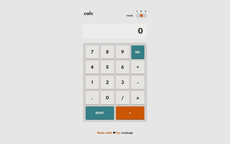
This is my solution to the calculator app challenge, built with React.js, and a combination of Styled Components and CSS.
Community feedback
- @SouiciaPosted about 2 years ago
Hello Jean Claude,
Congratulation on finishing the calculator app. That's a pretty amazing feat! And everything works as intended and is comfortable to use.
I just found few ways to possibly make it better. Maybe use cursor: pointer on the buttons of the calculator. And concerning the calculator screen, you could add overflow-y: scroll so that when someone like me write 3 lines of calculations, we can scroll back up to look at the numbers. Also customizing the scrollbar that will appear may be a good idea as the default one is pretty huge. For a challenge (and if possible (I declare challenges of my own, when I can't even make this challenge :D)) the scrollbar could have different colors based on the theme you choose. One last thing, when I write 999999.....999 on your calculator, it feels like there is no padding-left and the number does not break line. So, I can't count how many digits :D.
Anyway, congratulation again! And have a great day :)
Marked as helpful0@nzabajpPosted about 2 years ago@Souicia Thank you for the comment. I have added the cursor: pointer on the buttons, and also added an x and y overflow to get around the challenges you faced while using the app. Feel free to take a look at it again and let me know what you think.
0
Please log in to post a comment
Log in with GitHubJoin our Discord community
Join thousands of Frontend Mentor community members taking the challenges, sharing resources, helping each other, and chatting about all things front-end!
Join our Discord
