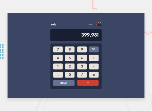
Calculator app built using React + Styled Components
Design comparison
Solution retrospective
Not sure how to properly handle overflow of calculator, for example 2/3 outputs 0.66666666... but I can't show the beginning since the display text is right aligned (using flexbox). As a result, the user only sees 66666666...
Community feedback
- @MojtabaMosaviPosted over 3 years ago
Hi!, nice job and regarding the overflowing, in my opinion you've handled well, you could alternatively reduce the height a tiny bit to eliminate the overflow. Two suggesiton for improvment:
1- When swiching from one theme to another the theme change happens to quickly and not so smoothly, to improve the UX you should add trasition it.
2- When a use inputs a invalid operation the error massage is somewhat cryptic, at the moment the massage is "syntace error" here you make the assumption that the user know what it means.
Keep coding :)
Marked as helpful0@HoangNguyen-CAPosted over 3 years ago@MojtabaMosavi thanks for the tips! I'll try to implement the improvements.
0
Please log in to post a comment
Log in with GitHubJoin our Discord community
Join thousands of Frontend Mentor community members taking the challenges, sharing resources, helping each other, and chatting about all things front-end!
Join our Discord
