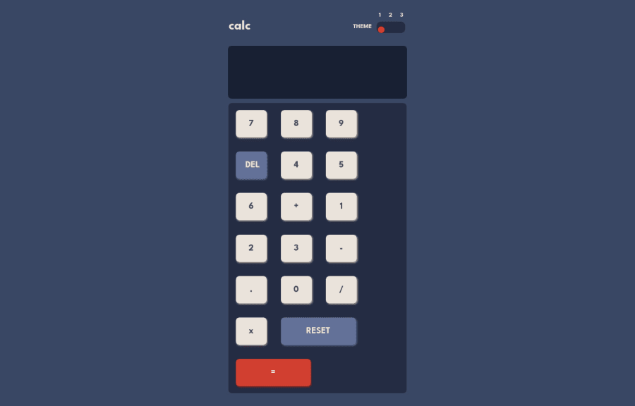
Design comparison
Community feedback
- @mattari97Posted over 2 years ago
Hello Chiamaka, congratulation on completing the challenge. I have some feedback for you on your solution:
1- I think that if you used the
display: gridproperty you would have a easier time with the layout. Grid is a little bit strange at first but you will see that for this type of design it is really fitting. I made a codepen example for you so you can understand the basics and here is a good article on that matter : Complete guide on grid2- I think that as a good practice you should try not to use % for sizing and spacing your elements. Because there is so many types of devices you will always be surprised by the result with this %. There is a lot a units like em, rem, vw, vh, vmin, vmax, ch, etc.... Here is a small article on that matter so you can take a look a them CSS Units W3School.
Have a nice day/night and happy coding.
Peace :)
Marked as helpful1@ChiamakaUIPosted over 2 years ago@AntoineC-dev Thank you, I will go through the resources and make changes.
0
Please log in to post a comment
Log in with GitHubJoin our Discord community
Join thousands of Frontend Mentor community members taking the challenges, sharing resources, helping each other, and chatting about all things front-end!
Join our Discord
