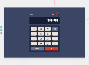
Design comparison
SolutionDesign
Solution retrospective
the del button it was kind of hard and also how to calc the number between each other
Community feedback
- @catherineisonlinePosted almost 2 years ago
Yes, this was very challenging for me as well, so much logic that you need to implement! I actually just used the calculator on my iPhone and tried to repeat some login from there.
What I noticed is that you definitely should set some limit of numbers you can have on the screen or at least make it responsive. If try to type a lot of numbers, it's going outside the the screen
1
Please log in to post a comment
Log in with GitHubJoin our Discord community
Join thousands of Frontend Mentor community members taking the challenges, sharing resources, helping each other, and chatting about all things front-end!
Join our Discord
