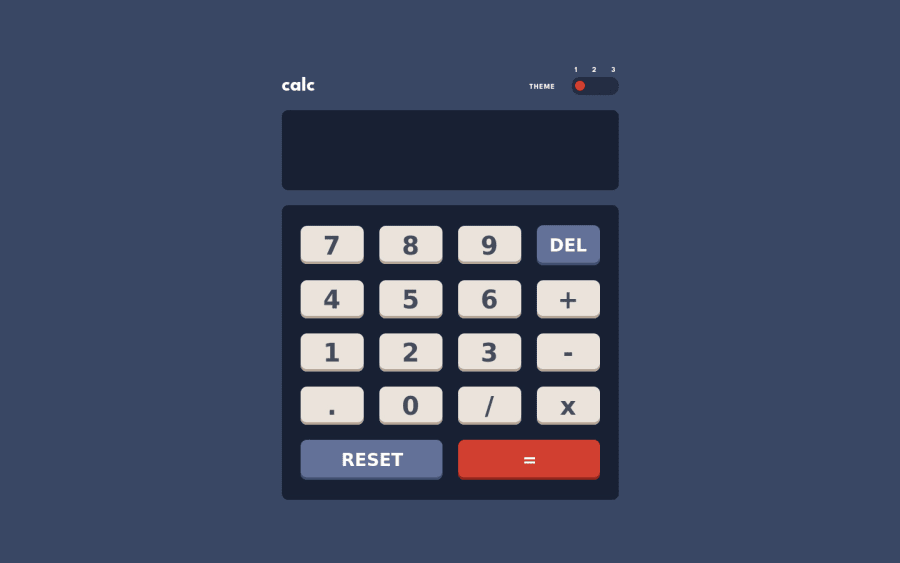
Design comparison
Solution retrospective
Any feedback and suggestions on how I can improve are very welcome! 😊 Thanks
Community feedback
- @ChamuMutezvaPosted about 2 years ago
Hi Darko Congratulations for completing the challenge , I hope you enjoyed the challenge. Here are a few things that you can have a look at.
- it is very important to have a CSS reset file , one most common one is A modern CSS reset by Andy Bell
- on my desktop , the top part is cut off , such that I can not see the radio buttons and the heading. This is a result of putting
height: 100vhon themainelement. Which brings me to say, avoid assigning heights on elements , let the element decide the height according to its contents. - at least set a maximum number of digits that the calculator/display should to take
- set conditions to avoid things as the following
2.5.6...5 - I cannot calculate a fraction such as
0.2 + 0.1, it is only taking a fraction on one operand only. That is , if the first number is a fraction then the second does not accept the decimal point.
Marked as helpful2P@Darko96Posted about 2 years agoHello @ChamuMutezva, Thank you so much for a feedback and suggestions. I changed everything, now my app is much better.
0 - @badshab454Posted about 2 years ago
Congratulations on completing this project.
1
Please log in to post a comment
Log in with GitHubJoin our Discord community
Join thousands of Frontend Mentor community members taking the challenges, sharing resources, helping each other, and chatting about all things front-end!
Join our Discord
