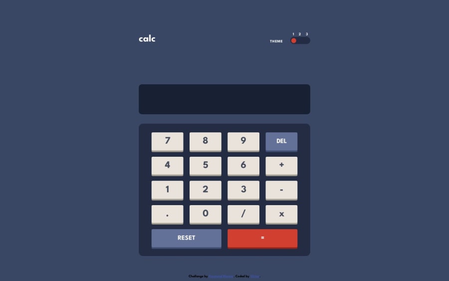
Design comparison
Solution retrospective
I can use some tips about the size of the divs and the layout of the page.
Community feedback
- @0xabdulkhaliqPosted over 1 year ago
Hello there 👋. Congratulations on successfully completing the challenge! 🎉
- I have other recommendations regarding your code that I believe will be of great interest to you.
BODY MEASUREMENTS 📐:
- Use
min-height: 100vhforbodyinstead ofheight: 100vh. Setting theheight: 100vhmay result in the component being cut off on smaller screens.
- For example; if we set
height: 100vhthen thebodywill have100vhheight no matter what. Even if the content spans more than100vhof viewport.
- But if we set
min-height: 100vhthen thebodywill start at100vh, if the content pushes thebodybeyond100vhit will continue growing. However if you have content that takes less than100vhit will still take100vhin space.
.
I hope you find this helpful 😄 Above all, the solution you submitted is great !
Happy coding!
Marked as helpful1 - @Kamlesh0007Posted over 1 year ago
Congratulations on completing the challenge! Your hard work and dedication are truly admirable. As you continue to hone your skills, here are a few suggestions that may be helpful:
Keep practicing and learning new things. The more you challenge yourself, the more you'll grow as a developer. Seek feedback from others. It's always helpful to get a fresh perspective on your work and learn from constructive criticism. Collaborate with other developers. Working with others can help you learn new techniques and improve your coding skills. Again, congratulations on completing the challenge, and I wish you continued success in your coding journey! 😁
Marked as helpful1
Please log in to post a comment
Log in with GitHubJoin our Discord community
Join thousands of Frontend Mentor community members taking the challenges, sharing resources, helping each other, and chatting about all things front-end!
Join our Discord
