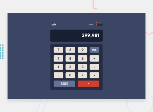
Design comparison
SolutionDesign
Community feedback
- @alishertoshmurodovPosted almost 2 years ago
Hi Hosanna! You did a great job on this project. However, you can do a few things to improve this project:
- Theme switch does not look as good as in the design files.
- Not precise subtraction when subtracting numbers with floating points.
- It would be best if you use CSS Grid for your keyboard.
- Validate your HTML code (You can use W3C Validator).
- Use correct fonts according to the style guide.
I hope this will be helpful. Best of luck, Hosanna!
0
Please log in to post a comment
Log in with GitHubJoin our Discord community
Join thousands of Frontend Mentor community members taking the challenges, sharing resources, helping each other, and chatting about all things front-end!
Join our Discord
