Design comparison
Solution retrospective
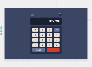
I tried to make this project more flexibale even the operation in the calculator app are standard but i included some extras to develop more the project so the javascript part was more challenging Any feedback is welcom
Community feedback
- @nelsonleonePosted almost 2 years ago
Hello, congrats on completing the challenge. Some things you should consider , maybe for next time. Don't you think users won't figure out clicking at a place in the toggle container changes the theme.
It would be better if clicking on the numbers or the toggle red icon toggles the theme change What do you think...
Marked as helpful0@NizarMjrPosted almost 2 years ago@nelsonleone Thank you for your feedback. I agree , it would be better the toggle container contains the button as well as the numbers of them. I take your note as consideration
0
Please log in to post a comment
Log in with GitHubJoin our Discord community
Join thousands of Frontend Mentor community members taking the challenges, sharing resources, helping each other, and chatting about all things front-end!
Join our Discord
