Design comparison
Solution retrospective
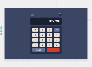
Made with html/css/javascript, the basics. The calculator logic went fine in my opinion but I got stuck with the toggle, as I didn't really know how to handle a 3 way switch like that. Learn something new everyday. I think I handled it in a bit of an weird way. I just turned off the opacity on the non active buttons since using display none and hiding it took them off the page and turned it back on depending on which button is active. Let me know if there's another way to do this. Also, I see now I have mobile problems. I've been practicing alot of javascript and I think I lost a step in my css fundamentals. The reset and equal buttons both gave me alot of problems. I appreciate all feedback.
Thanks!
Matt
Community feedback
Please log in to post a comment
Log in with GitHubJoin our Discord community
Join thousands of Frontend Mentor community members taking the challenges, sharing resources, helping each other, and chatting about all things front-end!
Join our Discord
