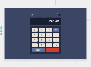
Design comparison
Solution retrospective
Hello everyone,
I am Namrata and this is my solution for this challenge.
If you have any suggestions to improve my code, please feel free to share!
Thank you 🙏
Community feedback
- @amirhossein-peyvandPosted about 1 year ago
Hey, well done! :) I recommend you to set a min-width for your main element (".calc" class) or you can use clamp() function. It can be used to ensure that an element does not grow or shrink beyond certain dimensions, providing more control over layout and design. And you can use mobile-first approach for styling your projects. It will be easier for you to adjust the project for larger devices.
Marked as helpful0@nmrtsnhPosted about 1 year ago@amirhossein-peyvand Thank you for the feedback. It was very helpful.
0
Please log in to post a comment
Log in with GitHubJoin our Discord community
Join thousands of Frontend Mentor community members taking the challenges, sharing resources, helping each other, and chatting about all things front-end!
Join our Discord
