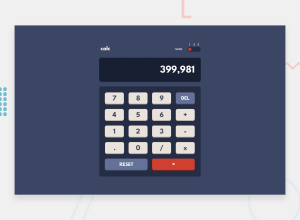
Design comparison
Solution retrospective
This one was a little difficult for me, especially for the Javascript part for the calculator function. It's not optimal, but I managed to get what I wanted with my own method.
On mobile, the button to change the theme(dark mode) is not a perfect circle. I checked it on inspector with both reactivity tool and simulation of mobile, and it worked very well, but when I test on a real mobile I don't have the same result so I'm stuck, if anyone can help me to fix it... All advice is welcome !
Community feedback
- @seanred360Posted over 2 years ago
You should use a radio button for the theme toggler. This is more semantically correct and it lets keyboard users and screen readers use your toggler. You should refactor your code to have 1 theme toggler function that accepts a theme object as an argument. You need 3 theme objects. The theme1 object should look like this
const theme1 = { body: "hsl( var(--clr-main-bg-blue))", text: "hsl( var(--clr-text-white))", keyButtonText: "hsl( var(--clr-text-grayishBlue))", screenBg: "hsl( var(--clr-screen-bg-blue))", keyButtonBg: "hsl( var(--clr-screen-bg-blue))", };that way your code is shorter and you only need to make changes in 1 place. I made a pull request on your Github. You can read my comments and see how I would implement these changes
Marked as helpful2@CarvalhoVincentPosted over 2 years ago@seanred360 Thank you for taking this time to help me!! I will try your solution soon.
0
Please log in to post a comment
Log in with GitHubJoin our Discord community
Join thousands of Frontend Mentor community members taking the challenges, sharing resources, helping each other, and chatting about all things front-end!
Join our Discord
