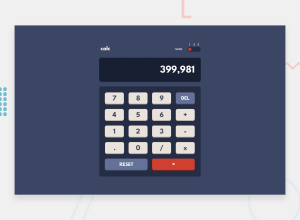
Design comparison
SolutionDesign
Solution retrospective
What are you most proud of, and what would you do differently next time?
Simplify the theme switcher and use buttons instead of inputs
I am not very happy with the adaptive design. It looks good on all devices BUT when resizing the screen, on some widths it can look “weird”
What challenges did you encounter, and how did you overcome them?Some of the logic took me a while, but after some console logs could fix it
Community feedback
Please log in to post a comment
Log in with GitHubJoin our Discord community
Join thousands of Frontend Mentor community members taking the challenges, sharing resources, helping each other, and chatting about all things front-end!
Join our Discord
