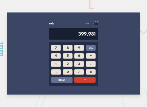
Design comparison
Solution retrospective
I managed to make it work in what i would say a decent fashion.
I'm not sure how to make the backend calculator functionality of it very well, I feel like I made it in a very hacky way that works but most likely has a very large amount of issues and bugs.
This is the first time i tried implementing any sort of themes and also first time storing a variable in localstorage. I feel like it got a little messy with different small elements changing color for each theme making me create very specific css variables. Is this the correct way of doing this? Or is there a better way that I didn't realise.
Over all I'm happy with how this turned out and would love it if you have any criticisms, pointers or thought for me.
Thanks for looking and reading!
Community feedback
- @MountainbeachPosted over 2 years ago
For some reason the text inside the buttons are slightly misaligned as easily seen on the 9 and DEL button. This is not the case when I view the website myself and I do not understand why this is the case.
0
Please log in to post a comment
Log in with GitHubJoin our Discord community
Join thousands of Frontend Mentor community members taking the challenges, sharing resources, helping each other, and chatting about all things front-end!
Join our Discord
