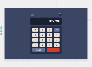
Design comparison
Solution retrospective
Hello World! Here is my Calculator app challenge, if you like it give me like and any improvement advice will be well received! Thank you so much!
Community feedback
- @b-a-merrittPosted almost 3 years ago
One small thing: clicking on the button to change the theme doesn't work. I had to dive into dev tools to figure out that I had to click on the numbers. This was backwards for me in terms of UI / UX.
If you agree, moving your buttons to where
switch-buttondiv lives and making their::beforecontents equal to the numbers (essentially swapping containers) would solve this.If not, at least at a hover state to the numbers so people like me might figure it out more intuitively.
Either way, I'm a huge fan of how clean your JavaScript is written and commented!
Marked as helpful0@Lourdes84Posted almost 3 years agoHi @b-a-merritt ! I have corrected the theme selector just as you recommended me. Thank you for your advice, it helps me a lot to improve my code. Thanks! Have a nice day!
1 - @AdekolaThanniPosted almost 3 years ago
You've done a great job!, to even make it better try to enable the users to see what operations they've chosen... That should improve the user experience... Have a great time coding!
Marked as helpful0@Lourdes84Posted almost 3 years agoThank you for your recommendation @AdekolaThanni !
0
Please log in to post a comment
Log in with GitHubJoin our Discord community
Join thousands of Frontend Mentor community members taking the challenges, sharing resources, helping each other, and chatting about all things front-end!
Join our Discord
