Design comparison
Community feedback
- @OneManBannedPosted almost 2 years ago
Hi Ramesh -
Your solution looks very nice.
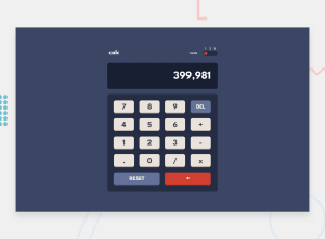
Although I did notice that if I entered a very long number it overflows the container. setting
.screen-div { overflow: hidden; }would be one way of solving that problem.
I think that theme toggle would be better as three radio buttons, with the numbers being their labels. That way someone could click on the buttons or the numbers to activate them.
Also your stylings on the body tag
body { width: 100vw; height: 100vh; display: grid; place-items: center; }On some screens you have a large gap at the top because the contents of the body are being centred. Perhaps using flex-box here and adding some margin to the body would be a possible solution
Finally, it's very impressive to me that you've done all this with just javascript and css.
Good work
Brendan.
0
Please log in to post a comment
Log in with GitHubJoin our Discord community
Join thousands of Frontend Mentor community members taking the challenges, sharing resources, helping each other, and chatting about all things front-end!
Join our Discord
