Submitted about 2 years ago
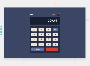
React calculator app with multiple theme
#react#tailwind-css
@Antonio0402
Design comparison
SolutionDesign
Community feedback
- @Pawel1894Posted about 2 years ago
Great job! It is working really nice.
I have one suggest, I would add overflow-x on screen element. I think it is better UX than screen growing up in height when result is long.
1
Please log in to post a comment
Log in with GitHubJoin our Discord community
Join thousands of Frontend Mentor community members taking the challenges, sharing resources, helping each other, and chatting about all things front-end!
Join our Discord
