Design comparison
SolutionDesign
Solution retrospective
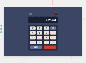
The calculator input parsing took a lot longer than i anticipated. Need to find a better way to organise all the color variables.
Community feedback
- @catherineisonlinePosted almost 2 years ago
Looks awesome! Place calc in the h1 tag, not in the div, and also try to type a lot of numbers and you will see how the calculator goes wide and then the text on the screen goes over it, might want to fix that 😊
Marked as helpful1@peta-8-bitPosted almost 2 years ago@catherineisonline Thanks for the feedback. I didn't think about overflow case at all. I will fix it.
0@catherineisonlinePosted almost 2 years ago@peta-8-bit yeah, I had the same problem when I did this project 😃
1
Please log in to post a comment
Log in with GitHubJoin our Discord community
Join thousands of Frontend Mentor community members taking the challenges, sharing resources, helping each other, and chatting about all things front-end!
Join our Discord
