Design comparison
Solution retrospective
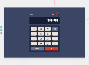
This was my first time handling multiple themes for a web page, I couldn't wait to do it sooner or later. The CSS side of the challenge I'm really happy with, maybe the top side of the calculator uses too many flexboxes but don't cause any problem. I basically use 0 media queries since the content takes straight 100vh and the calculator just needs a max-width to contain for desktop view, so it's all good. It was planned as mobile-first though, and it looks good there The calculator logic in Javascript though is REALLY messy, I did came up with it on my own, but it's basically reinventing the wheel. It's something you just take from somewhere else probably, but I did practice some DOM manipulation and switch so it's all good.
One thing I'd like to ask people reading, I wanted to implement the possibility to drag the slider for the themes, but deemed it too complicated, was it easy enough for me to do? I might still implement it to get some eventListener experience under my belt
Community feedback
Please log in to post a comment
Log in with GitHubJoin our Discord community
Join thousands of Frontend Mentor community members taking the challenges, sharing resources, helping each other, and chatting about all things front-end!
Join our Discord
