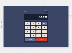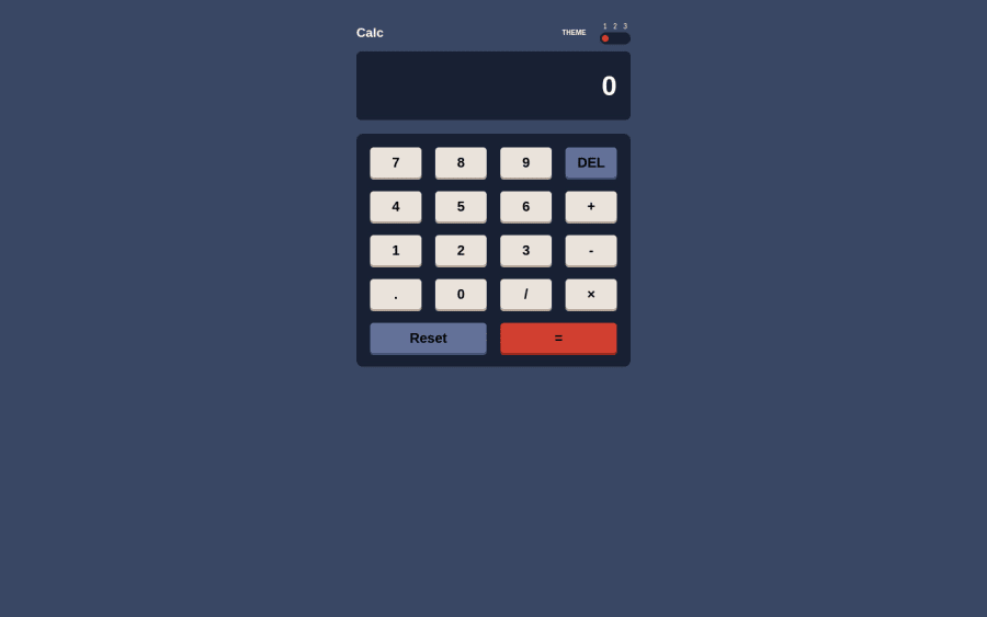
Design comparison
Solution retrospective
the project was easy. i didnot tackle any problems
i am sure of my code i tested it many times
no
Community feedback
- @k-stopczynskaPosted about 2 years ago
Hi!
congratulations on completing the challenge!
It sure looks good although could be centered as in design. Nice job with theme switcher.
Just tested the live version and there are 4 things that shouldn't be happening:
--if you subtract by 0 you should get an error not Infinity --if a user type 18 signs or more- it starts to overflow in X axis -- if a user try to get even 6 decimal digits and subtract it by another decimal- it starts to overflow in Y axis -- there is a problem with big numbers (I didn't get the result as in my calculator) And from user point of view- calculator should have an option to use with keybord.
Hope this helps:) Happy coding!
Marked as helpful0@AhmedAbdulatifPosted about 2 years ago@k-stopczynska Thanks for your helpful feedback I will work on it
0
Please log in to post a comment
Log in with GitHubJoin our Discord community
Join thousands of Frontend Mentor community members taking the challenges, sharing resources, helping each other, and chatting about all things front-end!
Join our Discord