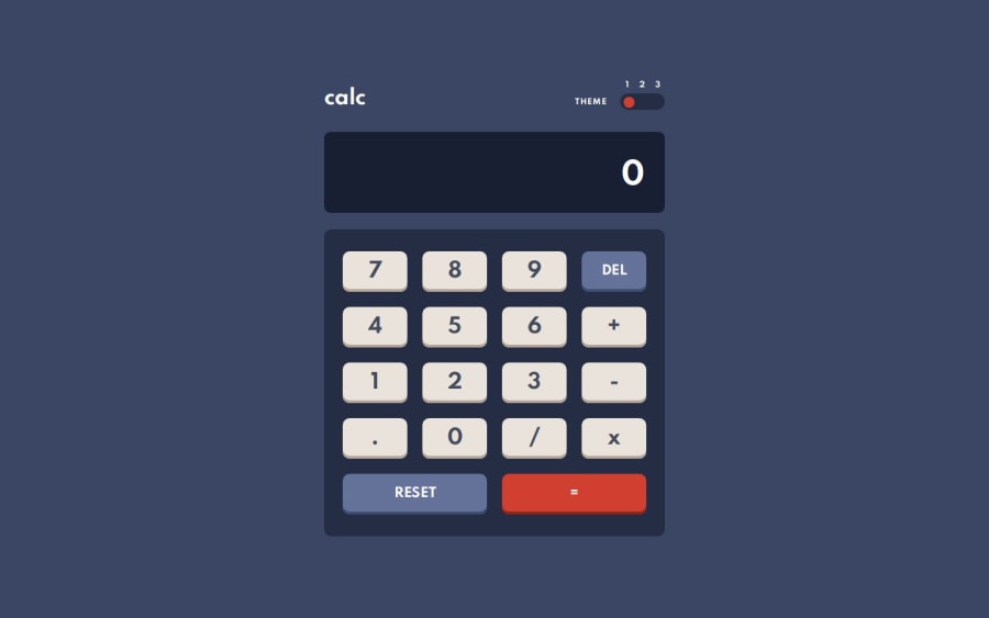
Design comparison
Solution retrospective
Proud of: I’m most proud of creating a user-friendly, responsive calculator interface that handles complex calculations reliably, improving the user experience across devices.
What I'd do differently: Next time, I'd consider optimizing code efficiency further, perhaps by implementing custom hooks to manage repeated logic, and I’d focus on adding more animations to enhance interactivity.
What challenges did you encounter, and how did you overcome them?Math Logic: Managed complex operations with stack-based processing and handled decimal precision using toFixed().
User Interface: Used responsive design with TailwindCSS, tested layouts for mobile and desktop for user-friendly navigation.
State Management: Ensured accurate UI updates by structuring state to handle sequential button presses effectively.
What specific areas of your project would you like help with?Code Optimization: Are there ways to refactor my code for better readability and efficiency, particularly in managing state and conditional rendering within the calculator component?
Responsive Design: While I’ve implemented a responsive layout, I’d appreciate feedback on how to improve responsiveness across different screen sizes, especially for mobile views.
Error Handling: Any advice on enhancing error handling for invalid inputs or edge cases would be helpful to make the app more robust.
UI Feedback and Animations: I'd love input on adding subtle animations or UI feedback elements (like loading indicators) to improve user interaction.
Accessibility: Are there additional accessibility improvements I could make to ensure the app is usable for a broader audience?
Community feedback
Please log in to post a comment
Log in with GitHubJoin our Discord community
Join thousands of Frontend Mentor community members taking the challenges, sharing resources, helping each other, and chatting about all things front-end!
Join our Discord
