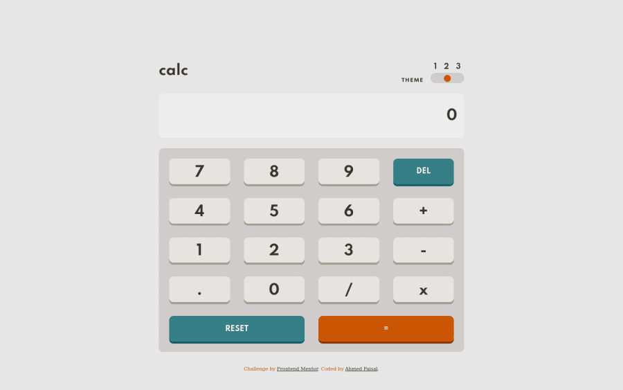
Design comparison
Solution retrospective
Feedback required
Please log in to post a comment
Log in with GitHubCommunity feedback
- @afrussel
Also on .theme class make border: 0
- P@palgramming
You should limit the
.key so on each value entered to be calculated there can only be one.in each entry and so the user cannot enter a number that looks like this1.2.3.4.5.6.7.8.9 - @B1N4R1
Hi uiguy,
Great solution to the challenge! Both the layout and the calculator logic are great.
Here some little suggestions:
- I would get rid of the
max-width: 770pxon the 600px media-query the calculator looks too stretched to my eyes. - I would avoid letting the user type in multiple periods (......). This is causing some problems when making calculations. Like for example you can calculate 8 + 6...... which is giving some syntax error.
Btw, nice work with the theme toggle too.
Cheers!
- I would get rid of the
Join our Discord community
Join thousands of Frontend Mentor community members taking the challenges, sharing resources, helping each other, and chatting about all things front-end!
Join our Discord
