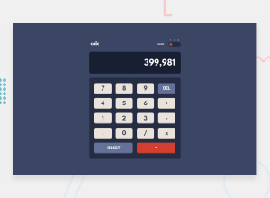
Design comparison
Community feedback
- @Kamlesh0007Posted over 1 year ago
Hello there 👋. Good job on completing the challenge !
In general, the solution is excellent. I have 2 small suggestions:
CSS 🎨:
Yes, there are other ways to center the card without using flex. One way is to use the grid layout: .container { display: grid; place-content: center; min-height: 100vh; } You can read more about centering in CSS here 📘. Note⚠️: Use min-height: 100vh instead of height. Setting the height to 100vh may result in the component being cut off on smaller screens, such as a mobile phone in landscape orientation. Note⚠️: You can also use position: relative, but using it in this type of component is a bad idea because it will clip it on mobile devices. CSS Reset 🔄:
Currently, you have a vertical scrollbar, which is due to the default margin that some browsers apply to the body element. To remove it and avoid problems in future challenges, I recommend starting to use a CSS reset. A CSS reset is a set of CSS rules that are applied to a webpage in order to remove the default styling of different browsers. CSS resets that are widely used: "My Custom CSS Reset" by JoshWComeau Reset CSS I hope you find it useful! 😄 Above all, the solution you submitted is great!
Happy coding!
0
Please log in to post a comment
Log in with GitHubJoin our Discord community
Join thousands of Frontend Mentor community members taking the challenges, sharing resources, helping each other, and chatting about all things front-end!
Join our Discord
