Design comparison
SolutionDesign
Solution retrospective
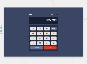
I felt I did well with the appearance & theming, but the calculator output display isn't perfect.
Community feedback
Please log in to post a comment
Log in with GitHubJoin our Discord community
Join thousands of Frontend Mentor community members taking the challenges, sharing resources, helping each other, and chatting about all things front-end!
Join our Discord
