Design comparison
SolutionDesign
Community feedback
- @TheRealByteraverPosted about 2 years ago
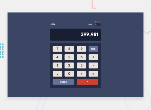
Nice design, very close to the original. I like how you insert comma's in big numbers for easier reading. I noticed that dividing a very big nr like 10000000000 by 10 for example does not yield a correct result though. Also, the way the operator changes after you entered the second operand (e.g. 2+2x8 becomes 2x28) is a bit counterintuitive in the beginning maybe. The mobile design seems a bit too tall, too.(I personally tried to solve this without using media queries but couldn't in the end ;)) I like how the theme transition is animated. Cool implementation, Congratulations!
0
Please log in to post a comment
Log in with GitHubJoin our Discord community
Join thousands of Frontend Mentor community members taking the challenges, sharing resources, helping each other, and chatting about all things front-end!
Join our Discord
