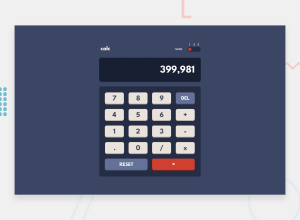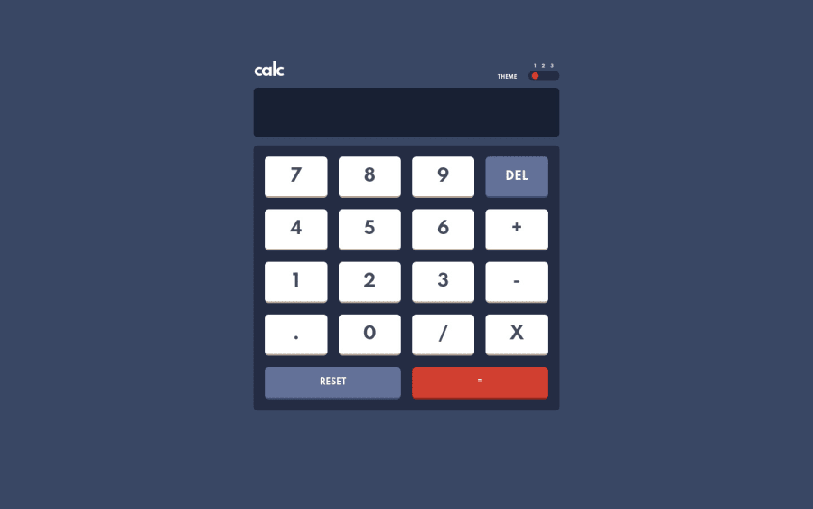
Design comparison
Solution retrospective
It was a long journey to make it work even though it isn't the hardest challenge here but I retook some lectures from the course of Jonas Schmedtmann. I hope It'll look responsive in your device!
Community feedback
- @omonteonPosted over 3 years ago
Hey Mili,
Congrats on finishing the challenge, I just submitted this one a few days ago too. Below I share my findings, I hope these are helpful :)
Highlights:
- It's cool that you made the calculator display editable.
Possible improvements:
- There are accessibility errors in your report, you might want to take a look at those first. You need to use at least one main element and one h1. I would suggest to use the h1 by replacing the h2 you already have.
- The number buttons are divs, I would suggest to use buttons so that you could navigate through them using a keyboard.
- The theme switcher does not work when you click below the number of the theme. In my opinion, it should work by clicking there too.
- The display lets you input letters and other characters that are not numbers.
- There are no hover states on buttons nor theme switch.
- The size of text does not seem correct nor the background color of the buttons, you might want to take a look again to the figma file.
Marked as helpful0@milimynamePosted over 3 years ago@omonteon Hi! I haven’t expected to get an early feedback. I wanna thank u for improvements. Sure, I did some semantic mistakes though I knew about them during the project but It wasn’t my priority. I didn’t know how to make the btn click work. But now I think I figured out but I don’t wanna implement it in the project. It’s not the best perfect example but I moved to more premium project I need to build. I just changed to the status of pro. One project I definitely will struggle but I got a design file. I hope I’ll succeed before I start building my own website.
1@omonteonPosted over 3 years ago@kamilMaksudov Got it !I assumed you had access to the figma files before you started the challenge, my mistake.
If I may suggest something for future challenges, maybe add what's your priority and what's not in the "questions for the community" section so that the feedback is more appropriate.
Looking forward to see your next challenge :)
0
Please log in to post a comment
Log in with GitHubJoin our Discord community
Join thousands of Frontend Mentor community members taking the challenges, sharing resources, helping each other, and chatting about all things front-end!
Join our Discord